

How to Create Graphs in Google Sheets
Learn how to create and format tables in Google Sheets. This guide covers sorting, filtering, borders, headers, and styling tips for clean, organized spreadsheets.
This document outlines the steps to create graphs using population data.
The guide is designed to help you select different types of charts to visualize data effectively, using a dataset of city-wise population in India.
If you're working in Google Sheets and want to organize your data nicely, creating a table is a great option. You can either turn your current data into a table or use one of Google’s built-in templates. Here's how you can do both:
1. Turning Your Existing Data into a Table
Open your spreadsheet
First, make sure you’ve opened the Google Sheet where you want to create the table.Select your data
Click and drag to highlight the cells that contain the information you want to format as a table.Format it as a table
Go to the top menu and click on Format, then choose Convert to table. A small box will pop up asking for a few details—like whether your first row should be used as headers.Apply the changes
Once you're happy with the settings, click Convert to table. Google Sheets will format your data into a clean, structured table with sorting and filtering options.
2. Using a Table Template
Open your spreadsheet
Start with the sheet where you want to insert the new table.Browse table templates
Click on Insert in the menu bar, then go to Tables. A panel will appear with a bunch of pre-made table templates grouped by things like event planning, project tracking, or travel planning.Pick the one you like
Hover over each template to see a preview. Once you find one that suits your needs, click on it to insert it into your sheet.Customize your table
Now just update the content—replace the sample data with your own, adjust the headers, change colors, and make it look the way you want.
Step-by-Step Guide: How To Make Table In Google Sheets
Step 1
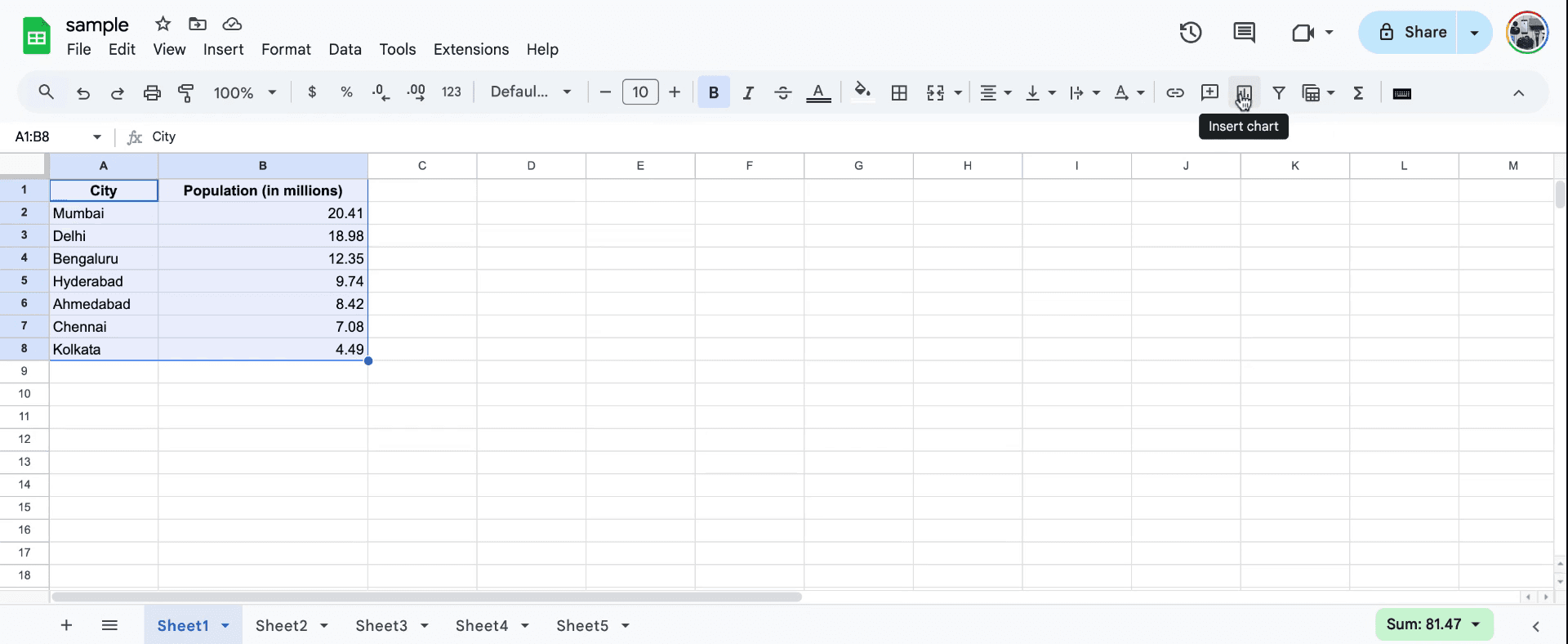
Begin by watching the video tutorial, which will guide you in creating graph machines. A list of the population is provided. Next, select the cell corresponding to the city-wise population data in millions within India. Navigate to the right-hand side to find the "Insert Chart" option. Select this option to proceed with choosing a chart type.
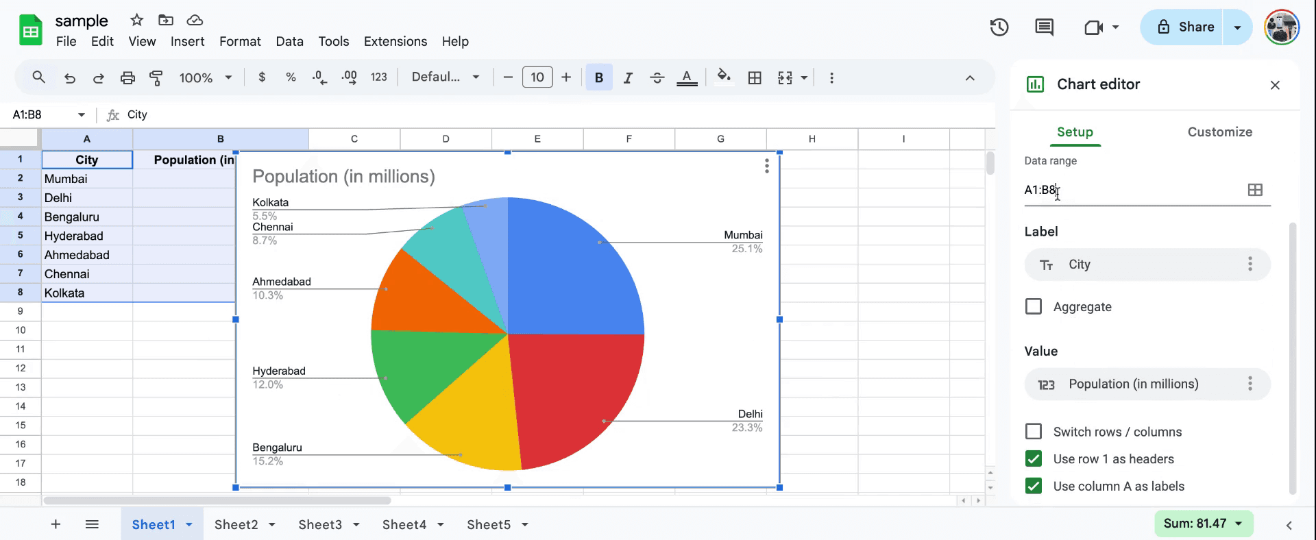
Step 2
You will have the option to choose from various types of charts, such as a pie chart. Select the data range you wish to use for the chart, specifying the starting and ending points.Label the chart appropriately with categories like "City" and "Population." This helps in clearly displaying the relationship between city names and their population figures.
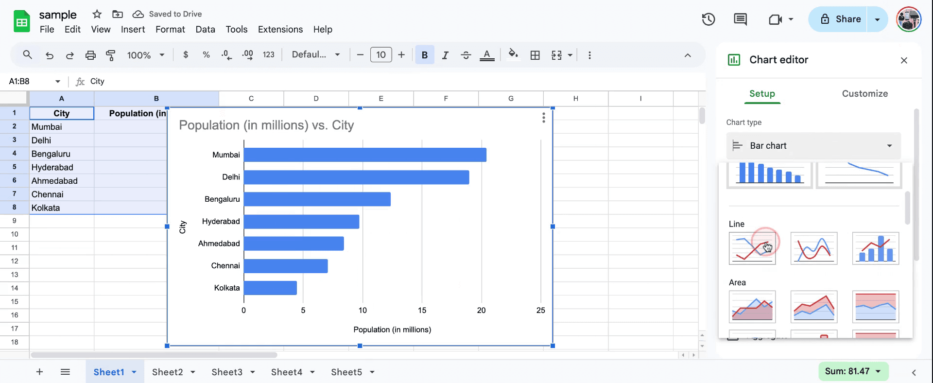
Step 3
Explore additional chart types such as line charts. Select the type that best represents your data and preferences.so thats how to create graphs in a sheets.
Step 4
Review the chart to ensure that all labels are correct and that it accurately represents your data. With this, you have successfully prepared a chart using the spreadsheet software. Thank you for following along.
Pro tips for creating graphs in a Google Sheet
Select your data properly: Highlight the data you want to visualize, including both labels and numbers. Then, go to Insert > Chart to let Google Sheets automatically create a chart based on your data.
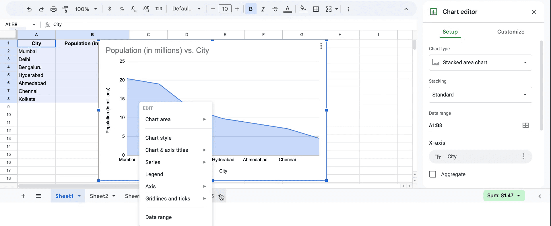
Customize your chart: Once the chart is created, you can fine-tune the graph by clicking on the chart, then selecting the Chart Editor panel on the right. Here, you can change chart type, axis labels, and colors to make your graph more readable.
Use different chart types: Depending on the type of data, you may want to use different graph styles. Use line graphs for trends, bar graphs for comparisons, and pie charts for parts of a whole. You can change the chart type in the Chart Editor under the "Setup" tab.
Common pitfalls and how to avoid them for creating graphs in a Google Sheet
Missing data labels: Not including labels for your data can make the graph unclear. Fix: Always ensure your rows/columns include clear headings or labels.
Wrong chart type: Selecting the wrong chart type can confuse the message you're trying to convey. Fix: Always choose a chart type that fits the data you're representing, like line graphs for trends or pie charts for proportions.
Inconsistent data range: Sometimes, graphs fail to capture all the necessary data if you select an incorrect range. Fix: Double-check that your data range includes all relevant rows and columns before creating the chart.
Common FAQs for creating graphs in a Google Sheet
How do I change the chart type in Google Sheets? After selecting your chart, go to the Chart Editor and click on the "Chart Type" dropdown to choose from various chart options like bar, line, or pie.
Can I add titles and labels to my chart? Yes, you can add and edit titles and axis labels under the Chart Editor > Customize tab.
Why is my graph not displaying correctly? This could be due to incorrect data range or a mismatch between the data type and the chart. Fix: Check the data range and ensure the values match the selected chart type.
How to screen record on mac?
To screen record on a Mac, you can use Trupeer AI. It allows you to capture the entire screen and provides AI capabilities such as adding AI avatars, add voiceover, add zoom in and out in the video. With trupeer’s AI video translation feature, you can translate the video into 30+ languages.How to add an AI avatar to screen recording?
To add an AI avatar to a screen recording, you'll need to use an AI screen recording tool. Trupeer AI is an AI screen recording tool, which helps you create videos with multiple avatars, also helps you in creating your own avatar for the video.How to screen record on windows?
To screen record on Windows, you can use the built-in Game Bar (Windows + G) or advanced AI tool like Trupeer AI for more advanced features such as AI avatars, voiceover, translation etc.How to add voiceover to video?
To add voiceover to videos, download trupeer ai chrome extension. Once signed up, upload your video with voice, choose the desired voiceover from trupeer and export your edited video.How do I Zoom in on a screen recording?
To zoom in during a screen recording, use the zoom effects in Trupeer AI which allows you to zoom in and out at specific moments, enhancing the visual impact of your video content
Related Tutorials

