Trupeer Blog
Özetle
You’re probably in one of two situations right now. Your company already has a “knowledge base,” but it’s really a pile of half-updated articles, scattered videos, and support answers trapped in tickets. Or you’re collecting knowledge base examples because you know the current setup isn’t scalable, and you need something people will use.
A great knowledge base is more than a glorified FAQ page. It’s a working system for reducing repetitive support, helping buyers and users find answers faster, and keeping internal know-how from disappearing every time a process changes. We’ve analyzed standout examples to isolate the patterns that matter most: information architecture, search quality, content design, governance, and maintainability. This guide breaks down seven strong examples, not just to admire their design, but to show what they get right and how to recreate the same outcomes with AI and a single screen recording.
Table of Contents
1. Trupeer Inc.

A support lead records a new workflow after a product update. Then the actual work starts. Someone turns it into a help article, someone else grabs screenshots, another team makes a training video, and a month later half of it is already outdated.
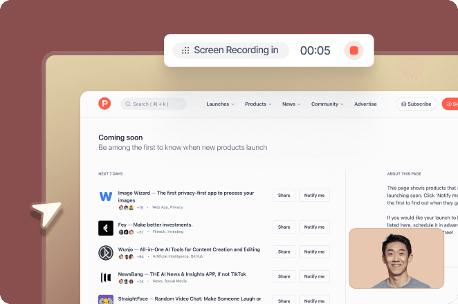
Trupeer is useful because it cuts that production chain down to one input. Record the workflow once, and the platform turns it into step by step documentation, videos, screenshots, and searchable knowledge assets. That changes the economics of keeping a knowledge base current, which is the part many teams underestimate.
Why Trupeer stands out
The core advantage is not prettier help content. It is a faster content system. Teams can capture a process in its real environment, narrate it naturally, and publish multiple formats from the same source material. For a practical model of what that looks like in search, this guide on building an AI searchable video knowledge base with timestamped answers is worth reviewing.
That matters in companies where the same workflow has to show up in three places at once. Customer education needs an article. Enablement needs a walkthrough. Sales needs a demo asset. If each format has its own owner and production cycle, the knowledge base becomes a coordination problem before it becomes a content problem.
Trupeer also clears a hurdle that blocks a lot of internal rollouts. Security and admin controls are built for larger teams, including ISO 27001, SOC 2, GDPR, SSO, SCIM, and granular permissions. Multilingual support matters too, especially for support and operations teams serving different regions from the same source content.
Practical rule: If the same process needs to live as a doc, a video, and a training asset, create it once from the workflow itself. Do not assign three teams to recreate the same knowledge in three formats.
Where it works best and where to watch it
Trupeer fits teams with repeatable workflows that change often. Good examples include onboarding flows, product walkthroughs, internal SOPs, pre-sales demos, customer success training, and change management documentation. For the internal side of that list, internal wiki software keeps SOPs and onboarding flows easy to find.
The trade-off is straightforward. AI generation saves time, but generated voiceovers, translations, and avatars still need human review when wording is sensitive, highly technical, or regulated. That is not a flaw. It is the normal boundary between fast first drafts and publish ready documentation.
A practical way to evaluate it:
Best fit: Teams that want one workflow capture to produce docs, videos, and searchable answers.
Operational upside: Multilingual output, AI search, and enterprise controls make it usable beyond a basic help center.
Watch closely: Technical terminology and compliance language still need review before publishing.
Buying friction: Public pricing is not listed, so procurement usually starts with a sales conversation.
If I were rebuilding a knowledge base today, I would look closely at this model first. The actual bottleneck is usually not article design. It is the slow, expensive process of producing and updating knowledge after every product change.
2. KnowledgeBase (LiveChat)

A team usually notices the same problem at the same time. Support says customers cannot find answers. Marketing says the help center looks dated. Product says the content is technically correct. The underlying issue is often structure, not accuracy.
The KnowledgeBase roundup from LiveChat is useful for diagnosing that gap. It is less valuable as a platform evaluation and more valuable as a pattern library for teams that need to sharpen their judgment fast.
What it gets right
Its strength is visual clarity. You can quickly assess search placement, category design, article hierarchy, mobile readability, and the small interface choices that reduce hesitation. That matters because weak knowledge bases rarely fail for one dramatic reason. They fail through dozens of small UX misses that make users second-guess where to click, what to trust, or whether the answer is current.
That makes this a strong reference point for early and mid-stage teams fixing findability problems. If article templates feel inconsistent or category pages have grown messy over time, these examples give stakeholders something concrete to react to. In practice, that shortens feedback cycles. Teams stop arguing in generalities and start making specific calls about navigation labels, page layout, and writing standards.
It also highlights a useful truth. Good help centers are predictable.
Users should be able to scan the homepage, guess where an answer lives, and reach it without friction. A polished brand layer helps, but the winning pattern is always the same: clear paths, readable articles, and cues that reduce effort.
The trade-off is scope. This collection focuses on what the user sees, not the operational system behind it. It will not tell you much about content governance, ownership models, update workflows, or how to keep documentation accurate when product steps change every week.
That is why this section matters in a broader teardown of knowledge base examples. LiveChat shows what strong front-end knowledge design looks like. It does not solve the production problem. If you want to build a similar experience without manually rewriting every article after each UI change, pair those design lessons with a workflow that turns one product walkthrough into publishable help content. A practical starting point is this guide on creating technical documentation and user guides.
Use KnowledgeBase by LiveChat as a benchmark for structure, readability, and information architecture. Then copy the parts that work, and use AI plus a single screen recording to produce and update that knowledge at scale.
3. monday.com

An employee needs to reset a finance workflow, find the latest approval path, and check who owns the process. If the answer lives across Slack threads, old docs, and ticket comments, the issue is not search. The issue is that the company does not have an internal knowledge system.
That is why the monday.com internal knowledge base examples guide earns a place in this list. It shifts the discussion away from polished public help centers and toward internal operations, where documentation has to support real work across HR, IT, service desks, and cross-functional teams.
The useful lesson is structural. Internal knowledge has different failure points than customer-facing support content. Access rules matter. Process steps change often. Articles need to reflect roles, approvals, dependencies, and what the reader should do next. A clean homepage helps, but it does not solve any of that on its own.
What monday.com gets right
monday.com is strong on one point many teams miss. Internal and external knowledge bases should not be built to the same standard because they are serving different jobs. Public help content is optimized for speed, clarity, and broad discoverability. Internal documentation also needs governance, ownership, and ties to day-to-day execution.
That distinction matters if you are auditing your own setup.
Role-based access: Some internal articles should be widely available. Others need team or function-level visibility.
Actionable article design: Good internal docs do more than explain. They tell the reader what system to open, what step to complete, and who to contact if the workflow breaks.
Clear ownership: Every SOP needs a team responsible for updates, especially when tools, approvals, or UI steps change.
This is also where the broader teardown matters. Plenty of knowledge base examples look good in screenshots. Fewer show how to produce documentation fast enough to keep up with internal process change. If you want to build the same kind of high-utility knowledge base without manually drafting every page, use a workflow for creating technical documentation and user guides from real product walkthroughs. One screen recording plus AI is often a better starting point than another blank template.
The trade-off is straightforward. monday.com is still presenting the topic through a vendor lens, so some of the framing supports its product story. Even so, the section is useful because it pushes teams to treat internal knowledge as an operating system for work, not a smaller version of a customer FAQ.
4. Stonly

A common redesign failure starts like this. The team reviews a few attractive help centers, argues about layout, approves a cleaner homepage, and ships without fixing the core bottleneck. Users still cannot get to an answer fast.
Stonly is useful because it pushes the review away from taste and toward criteria. Its examples are framed around information architecture, clarity, discoverability, and on-page experience. That makes it a stronger reference for audit work than a simple gallery of polished help centers.
Best for teams that need a scoring framework
If you are trying to diagnose why a help center feels slow, this approach helps. It gives stakeholders a way to talk about specific breakdowns. Start point confusion, weak category logic, vague article titles, and answers buried under brand copy are all easier to spot when the team is using a shared rubric.
That matters in practice.
A lot of knowledge base examples look good in screenshots and still fail during real use. A customer with a setup issue is not judging your visual system. They are judging click path, scan speed, and whether the article resolves the task before frustration sets in.
Audit lens: Score paths by time-to-answer, clarity of the next click, and whether the article solves the job without extra searching.
This section also highlights a useful trade-off. Stonly is stronger on front-end help experience than on back-end documentation operations. So if your problem is messy navigation, inconsistent article patterns, or poor self-serve flow, it gives you a solid benchmark. If your real issue is publishing speed, version control, or keeping docs current across product changes, you need more than an evaluation model.
That is the gap many teams miss. Studying strong examples helps you judge quality. It does not tell you how to produce that quality at scale. If the goal is to build a similar high-performing knowledge base quickly, the faster path is often a real workflow capture plus AI generation through Trupeer, not another round of manual outlining.
I’d use Stonly as a review tool. It is a strong reference for teams that need sharper standards before redesign decisions get approved.
5. ProProfs Knowledge Base

A support lead opens an article that should answer a simple setup question. The title is vague, the steps run together, screenshots look like they came from three different product versions, and the user still ends up filing a ticket. Teams in that position do not need another abstract lesson on taxonomy. They need tighter article craft. ProProfs Knowledge Base is useful for that reason.
Its examples stay focused on page-level execution: article structure, readability, search experience, media choices, and the difference between internal and customer-facing documentation. That makes it a practical benchmark for editors, support managers, and anyone building authoring standards.
Best for teams fixing article quality first
ProProfs is most helpful when the breakdown is happening inside the article itself. Common signs include bloated intros, headings that do not match the query, inconsistent screenshot use, and step-by-step instructions buried under explanation. Those are not minor issues. They directly slow time-to-answer.
What ProProfs gets right is the operational detail. A lot of knowledge base examples stay at the level of “improve search” or “organize content better.” This one gets closer to the decisions that change article performance: tighter headings, cleaner step order, clearer visual hierarchy, and better judgment about when a short video helps versus when it slows the reader down.
That matters because article quality changes support outcomes. In Helpjuice case studies summarized by Help Scout’s knowledge base metrics article, one SaaS company cut contact rate after turning legacy documentation into a searchable knowledge base and improved first-contact resolution by sending users to relevant articles. Better formatting and clearer answers are not cosmetic. They reduce support load.
There is a trade-off. ProProfs is stronger as a writing and presentation reference than as a system for long-term documentation governance. It will help a team improve article patterns faster. It will not tell you much about version control, review workflows, or content retirement.
That distinction matters if the goal is speed. Studying ProProfs can sharpen your standards for article design. If you want to produce those articles quickly, the faster path is often a workflow capture and AI draft generation through Trupeer from a single screen recording, then an editorial pass to clean up structure, screenshots, and search intent. That is how teams turn a good example into a repeatable production process.
6. HubSpot

A buyer lands on your help center from Google, reads two articles, and decides whether your product feels clear or risky. That is the use case HubSpot captures well.
The HubSpot roundup is useful because it evaluates knowledge bases as part of the full customer journey, not as isolated support assets. It looks at search, browsing, article coverage, and how the help experience supports trust before and after signup. For teams that want support content to contribute to acquisition, onboarding, and retention, that framing matters.
Strong model for discoverability and brand alignment
HubSpot is one of the better references for teams trying to make a help center feel connected to the product and brand. The patterns worth borrowing are practical. Clear category labels. Predictable article formatting. Titles that match the language users type into search. Paths that help readers move from a basic question to the next logical step without getting lost.
That approach has real upside. As noted earlier, strong knowledge bases can support both self-service and growth. A well-structured article library can answer pre-purchase questions, reduce hesitation during evaluation, and keep support content discoverable in search without turning every page into an SEO exercise. Good customer self-service software makes this kind of library easy to build and search.
A help center can answer pre-purchase questions as effectively as post-purchase ones when the taxonomy and article titles reflect the way buyers search.
There is a trade-off. HubSpot is stronger as a model for discoverability, editorial consistency, and customer journey alignment than for governance-heavy documentation operations. Teams that need strict approval flows, internal SOP control, or complex maintenance workflows will need a different reference point for that part of the system.
That is also why this example is more useful as a strategic teardown than a gallery pick. Study HubSpot for information architecture and content-market fit. Then use a faster production workflow, such as generating first drafts from a single screen recording in Trupeer, to build the same kind of high-clarity help content without spending weeks drafting from scratch.
7. Knowmax

A support lead notices the same pattern every week. English articles are decent, translated versions lag behind, search quality drops by region, and agents keep answering questions the help center should already handle. That is the situation Knowmax is useful for.
The Knowmax examples page is a good reference for teams trying to improve usability in high-volume support environments, especially across languages. It stays focused on the parts that shape resolution speed in practice: article wording, visual guidance, search experience, and localization consistency.
That makes this example more than a design swipe file. It is a practical teardown of what reduces friction for end users and what usually breaks when teams scale support content internationally.
Where Knowmax is most useful
Knowmax is strongest as a benchmark for multilingual self-service. A lot of SaaS teams still publish in English first and treat translation as a later content task. The result is predictable: outdated regional articles, inconsistent terminology, and weak search results outside the primary market.
As noted earlier, multilingual documentation needs a repeatable publishing system. It also needs tighter content operations than many teams expect. If screenshots, workflows, and UI labels change often, every language version becomes a maintenance problem unless the production process is fast and standardized.
That is where the Knowmax example set is useful to study.
It keeps attention on four execution details that directly affect whether users solve the issue themselves or open a ticket:
Plain-language titles: Good titles mirror the job the user is trying to complete, not the team’s internal naming.
Visual guidance: Screenshots and step-based visuals reduce misinterpretation in setup and troubleshooting flows.
Search relevance: Even well-written articles fail if search returns adjacent topics instead of the exact answer.
Localization control: Global help content only works when translated pages are reviewed and updated with the source content.
The trade-off is scope. Knowmax is better as a UX and localization model than as a reference for governance, approvals, or complex documentation operations. For content teams, that is still useful. Study the patterns, then recreate them with a faster workflow, such as turning a single screen recording into draft articles and visual documentation in Trupeer, so localization-friendly support content does not take weeks to produce.
Top 7 Knowledge Base Platforms Comparison
Product / Resource | Implementation complexity 🔄 | Resource requirements ⚡ | Expected outcomes 📊 | Ideal use cases 💡 | Key advantages ⭐ |
|---|---|---|---|---|---|
Trupeer Inc. | Lowest, enterprise onboarding, governance, deployment support | Low budget and engineering; minimal author editing after capture | Studio-quality videos + formatted docs, searchable multilingual KBs | Product demos, sales enablement, training, change management | End-to-end automation; enterprise security & scale |
KnowledgeBase (LiveChat) | Low, content roundup, no tooling setup | Low, reading and inspiration only | Design patterns and UI takeaways for KBs | UX audits, help-center inspiration, IA improvements | Broad, recent examples focused on usability |
monday.com | Medium, ties documentation to workflows and access control | Moderate, integration with ticketing and role-based tools | Internal KBs aligned to ticket outcomes and KPIs | Enterprise service, IT, HR knowledge + workflow mapping | Practical governance framing and workflow linkage |
Stonly | Low–Medium, evaluation rubric and example reviews | Low, review materials and rubric reuse | Audit-ready insights on IA, clarity, discoverability | Redesigns prioritizing time-to-answer and navigation | Transparent rubric and screenshot-backed takeaways |
ProProfs Knowledge Base | Low, long-form guidance and article templates | Low, author training and template adoption | Improved article structure, readability, and search | Teams early in KB maturity needing writing guidance | Beginner-friendly, page-level writing & layout tips |
HubSpot | Low, editorial roundup with SEO focus | Low–Moderate, content gap/SEO work for impact | Better discoverability, topic browsing, and SEO alignment | Product marketing, CS leaders, demand-generation | GTM-aligned guidance trusted by marketing teams |
Knowmax | Low–Medium, UX and localization emphasis | Moderate, localization and accessibility effort | Polished UX, stronger multilingual search and clarity | Global KBs requiring localization and UX polish | Concise UX checklist with multilingual/accessibility focus |
Build Your High-Impact Knowledge Base in Minutes
The best knowledge base examples share the same core traits. They respect the user’s time, make answers easy to find, and keep structure consistent enough that people don’t have to relearn the system every time they visit. Search matters. Navigation matters. Writing clarity matters. But the hidden variable is maintainability.
That’s where many teams get stuck. They can copy a clean help center layout, but they can’t keep the content fresh. Product changes pile up. Internal processes shift. Support, enablement, and marketing each create their own version of the same explanation. Before long, the knowledge base stops being a source of truth and becomes another layer of confusion.
The strongest pattern across these examples is not visual polish. It’s operational discipline. Good teams know which content deserves priority, how users look for help, and who owns updates. They also choose tools that reduce manual effort instead of creating more of it.
There’s real pressure behind that shift. Automated knowledge base support reduced ticket volume for deflected queries by 40% to 60%, reached NLP query matching accuracy of 95% on structured and unstructured data, and lowered support costs by up to 50%, with ROI realized in 3 to 6 months. Those results won’t come from publishing a prettier FAQ. They come from combining search, automation, and a system that learns from repeated questions.
That’s why Trupeer stands out in this category. Instead of forcing teams to document everything manually, it lets you capture a process once and turn that recording into a searchable knowledge base with articles, screenshots, videos, and structured guides. That approach is especially strong for product marketing teams, sales engineers, customer success leaders, IT teams, and operations managers who need documentation that stays current across multiple audiences.
If your current process still starts with a blank doc, you’re making knowledge harder to scale than it needs to be. Capture the workflow once. Let AI build the assets around it. Then focus your team on review, governance, and teaching users what matters.
If you want to build a knowledge base that’s maintainable, not just attractive on launch day, start with Trupeer AI. It turns a single screen recording into polished docs, searchable answers, and training content in minutes, which makes it a strong fit for SaaS, enterprise support, enablement, and internal operations teams.